Mi habitación de costura en progreso. Cap.4

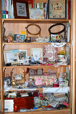
Esta vez le tocó a la vitrina donde guardo aquellas cosas que tienen más importancia para mí o que por no estar expuestas al polvo están bien guardaditas....pero a la vista.
El trabajo lo dediqué especialmente a forrar todo  la trasera con el mismo papel que utilicé en parte de la pared.
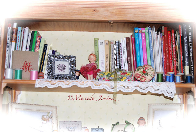
Luego rematar  todos los bordes con una puntilla blanca de algodón.


Este era el caos del que partía una vez que tuve que " almacenar " parte de las cosas antes de empezar a pintar.....
El cúmulo de cosas durante estos años pasados hacía necesaria una limpieza que diera " algo de luz " a este rincón.


Y después de estar un par de tarde este es el resultado........

Cerrado ............


Abierto.......


Balda superior con los libros  de bordado  y punto de cruz ...


La segunda con los  bolsitos bordados más pequeños y algunas de las muñecas de porcelana...


La siguiente  con  los detalles de colección y algún bordado más......


Ahora en tonos marrones...


 La última con las cajas y lo  que ocupa más volumen....


Creo que el aspecto saneado  y el  fondo nuevo hacen que se luzcan más todas las cosas  ¿ no os parece ?

....Por cierto ¿ hay alguna de las estanterías que te parece que ha quedado mejor acabada ? Me gustaría saber tu opinión. 


A la vuelta de vacaciones os cuento cómo ha quedado definitivamente.

¡¡¡¡¡Mil gracias Eva !!!!

El mundo está lleno de gente generosa, lo sé. Una de ellas es Eva. No nos hemos visto nunca pero ya nos conocemos.
Os he hablado de Eva en otra ocasión, también con otra sorpresa que me envió.
Hace ya unas semanas que llegó un paquete a mi casa. ¡ Qué puedo decir ...! Quedé sorprendida. Rescató un precioso bastidor antiguo en un mercadillo y allá que pensó en regalármelo.

Es algo especial porque es de los que tenían una cajita para guardar los hilos. Seguramente más de una ha tenido uno similar.


En el interior de la cajita   que ha forrado , ha incluido un  bordado con mis iniciales   hecho 1 /1.
Es la primera vez que forra una cajita y creo que le ha quedado estupenda.  El tono de las telas con el color de la madera queda precioso ¡ a mí me encanta !

Eva también añadió este paño   que encontró rebuscando entre otras cosas    y  que tengo    ya  colocado en la vitrina con el  resto de cosas , en mi habitación de costura.


Para mí tiene mucho mérito y por eso se lo agradezco desde aquí públicamente. Compartir con quien   aprecia este tipo de cosas es importante..... y más si se hace así .... desinteresadamente y porque sabes que vas a hacer feliz a otra persona.
¡¡¡¡ Un beso fuerte Eva !!!!!

Tree House Design - wooden house

Tree House designed by Sander Architects, located in Wilmington, Delaware.


Tree House Design - wooden house, modern house design, modern tropical house, interior design
From the heart to a quiet forest in Wilmington, Delaware, this contemporary tree house was admittedly a labor of love for architect Whitney Sander of Sander Architects. With a rushing stream at its feet, Tree House features a spectacular spiral staircase, running up the front of the home, past the modern Juliet-inspired balcony, and the expanse of glass that forms the front facade. The home’s very vertical construction places the master bedroom and living at the top, among the trees, with a rooftop deck as the most luxurious crowning touch.


Sj7JOA8wJlI/AAAAAAAACB4/EloFPu3wAoo/s400/Tree+House+Design+-+wooden+house.jpg
More about Tree House Design [via] modern house design.

Difundiendo Las labores de Mercedes

Se entiende por estar " entre PInto y Valdemoro " estar " a dos aguas "................ vamos que " ni fu ni fa ". Pues bien , la cosa tiene su historia.......Dicen que iba , no se sabe cuando , un borracho andando por el campo........ y cuando llegó al termino de una de estas localidades ( ...... porque PInto y Valdemoro son dos localidades reales de la Comunidad de Madrid ....) se situó en su " borde fronterizo "..... y saltando de un lado a otro decía : ".......Ahora estoy en Pinto..... ahora estoy en Valdemoro ...."

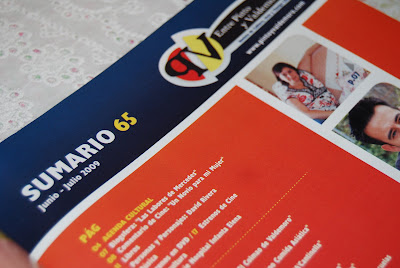
Este dicho conocido es así contado entre los parroquianos de la zona.... Pero Entre Pinto y Valdemoro no sólo es algo que decimos cuando estamos inseguros.... Es también una publicación que recoge la cultura, el ocio y el tiempo libre de estos dos pueblos.
El último número , salido este viernes pasado , tiene un apartado nuevo dedicado a la blogosfera...... y ahora es cuando entra este blog.....
Quisieron sus editores que empezara esta sección para dar a conocer los bloggers de la zona....


....Y aquí estoy , en una de sus hojas  y disfrutando de su compañía  un rato mientras hablamos de labores ....... Es la primera vez que  salgo publicada en papel, así que  me siento muy honrada  de que Oscar y Viki hayan confiado en mí para inaugurar  esta sección que también aparece en su versión online.
Quince mil ejemplares que se reparten gratuitamente  y que ya ando compartiendo con mis familiares.

Pincha  aquí para leer el artículo en su web.

Muchísimas gracias a Oscar y Viki por hacer posible  esta difusión.

Desain Interior Ruang Tamu Kecil Minimalis

Desain-Interior-Ruang-Tamu Kecil-Minimalist
Desain Interior Ruang Tamu Kecil Minimalis

Setelah sebelumnya kami posting desain interior ruang tamu kecil yang sejuk ceria maka di artikel yang ini kami akan berikan tips mendesain ruang tamu dirumah anda , ruang tamu diatas didesain pada ruangan yang kecil yaitu 3 m x 3,25 m, anda bisa melihat denahnya di artikel sebelumnya.

Menata interior ruang tamu di rumah layaknya arsitektur ruang atau arsitektur interior dengan ukuran yang bervariasi merupakan tantangan interior desain tersendiri. Selain harus layak menerima tamu, arsitektur desain ruang ini harus diatur agar nyaman dan interior ruangan tidak berkesan penuh seperti arsitektur dapur.

Demi kepraktisan, sebagian arsitektur ruangan meniadakan ruang tamu di rumahnya. Di rumah-rumah yang mungil, ruang tamu fungsinya seringkali digabung dengan ruang lain seperti interior kitchen. Misalnya tamu yang akrab langsung dipersilakan masuk di ruang keluarga. Sementara itu, tamu lain cukup diterima di teras rumah saja.

Namun untuk sebagian orang arsitektur ruang atau arsitektur interior, ruang tamu tetap jadi bagian yang sangat penting dalam arsitektur desain karena ruang tamu mencerminkan karakter si pemilik. Bagi arsitektur ruangan dan arsitektur dapur rumah dengan ukuran yang pas-pasan tentu selain harus layak menerima tamu, interior ruang ini harus diatur sedemikian rupa agar tidak terlalu menghabiskan ruangan. Bagi pemilik rumah yang cukup luas, tentu interior desain ini tidak akan menjadi masalah.

Di rumah mungil, ruang tamu tentu juga berukuran mungil, karenanya jangan memenuhi ruang tamu dengan furniture, apalagi meletakkan interior kitchen set atau interior dapur karena fungsi ruang tamu jelas jauh berbeda dengan ruang dapur. Cukup desain ruangan dengan sediakan sofa dengan dua dudukan (two seaters), satu sofa single seater, dan meja kecil. Apabila masih ada ruang lebih tambahkan meja sudut. Desain kitchen furnitur atau desain kitchen set yang ada jika memungkinkan letakkan disandarkan ke dinding agar ruang terlihat lebih lega.

Yang terpenting kitchen set dalam desain dapur peletakkan tidak mengganggu alur sirkulasi dari pintu masuk ke ruang-ruang lainnya. Di rumah dengan ukuran ruang tamu yang cukup luas atau luas, bisa diletakkan sofa dengan ukuran yang cukup besar, misalnya dengan sofa 3-2-1 seaters dan dengan meja tamu dan meja sudut dengan peletakkan yang hampir sama dengan rumah mungil agar tidak mengganggu alur desain kitchen set sirkulasi menuju ruang lainnya .

Agar tidak monoton, menggabungkan dua buah sofa yang berbeda sangatlah menarik. Beda disini maksudnya adalah beda bentuk, beda desain, ataupun beda warna. Untuk menjembatani interior kitchennya carilah benang merah antara keduanya, misalnya interior dapur berupa warna yang senada.

Di ruang tamu atau dapur dengan luas yang terbatas, lebih cocok diisi dengan furnitur atau kitchen set yang ringan, tempat duduk yang tebal, seperti sofa memberi kesan berat. Namun pemilihan sofa yang tepat bisa menjadikan ruang tamu tidak terkesan penuh dengan interior kitchen set.

Tips-tips desain ruangan dalam pemilihan sofa misalnya dengan warna terang, pilih sofa dengan dua seaters, jangan terpaku pada ukuran standar sofa (umumnya lebar 80cm) karena akan membuat ruangan desain dapur semakin sempit, pilih dengan ukuran 60 cm atau 50 cm, jika sofa ingin diletakkan menempel pada dinding, pilih sofa tanpa sandaran. Ini akan menghemat desain kitchen ruang ataupun ruang dapur juga sofa tanpa sandaran lengan.

www.architectaria.com

Desain Interior Ruang Tamu Kecil Minimalis

Desain-Interior-Ruang-Tamu Kecil-Minimalist
Desain Interior Ruang Tamu Kecil Minimalis

Setelah sebelumnya kami posting desain interior ruang tamu kecil yang sejuk ceria maka di artikel yang ini kami akan berikan tips mendesain ruang tamu dirumah anda , ruang tamu diatas didesain pada ruangan yang kecil yaitu 3 m x 3,25 m, anda bisa melihat denahnya di artikel sebelumnya.

Menata interior ruang tamu di rumah layaknya arsitektur ruang atau arsitektur interior dengan ukuran yang bervariasi merupakan tantangan interior desain tersendiri. Selain harus layak menerima tamu, arsitektur desain ruang ini harus diatur agar nyaman dan interior ruangan tidak berkesan penuh seperti arsitektur dapur.

Demi kepraktisan, sebagian arsitektur ruangan meniadakan ruang tamu di rumahnya. Di rumah-rumah yang mungil, ruang tamu fungsinya seringkali digabung dengan ruang lain seperti interior kitchen. Misalnya tamu yang akrab langsung dipersilakan masuk di ruang keluarga. Sementara itu, tamu lain cukup diterima di teras rumah saja.

Namun untuk sebagian orang arsitektur ruang atau arsitektur interior, ruang tamu tetap jadi bagian yang sangat penting dalam arsitektur desain karena ruang tamu mencerminkan karakter si pemilik. Bagi arsitektur ruangan dan arsitektur dapur rumah dengan ukuran yang pas-pasan tentu selain harus layak menerima tamu, interior ruang ini harus diatur sedemikian rupa agar tidak terlalu menghabiskan ruangan. Bagi pemilik rumah yang cukup luas, tentu interior desain ini tidak akan menjadi masalah.

Di rumah mungil, ruang tamu tentu juga berukuran mungil, karenanya jangan memenuhi ruang tamu dengan furniture, apalagi meletakkan interior kitchen set atau interior dapur karena fungsi ruang tamu jelas jauh berbeda dengan ruang dapur. Cukup desain ruangan dengan sediakan sofa dengan dua dudukan (two seaters), satu sofa single seater, dan meja kecil. Apabila masih ada ruang lebih tambahkan meja sudut. Desain kitchen furnitur atau desain kitchen set yang ada jika memungkinkan letakkan disandarkan ke dinding agar ruang terlihat lebih lega.

Yang terpenting kitchen set dalam desain dapur peletakkan tidak mengganggu alur sirkulasi dari pintu masuk ke ruang-ruang lainnya. Di rumah dengan ukuran ruang tamu yang cukup luas atau luas, bisa diletakkan sofa dengan ukuran yang cukup besar, misalnya dengan sofa 3-2-1 seaters dan dengan meja tamu dan meja sudut dengan peletakkan yang hampir sama dengan rumah mungil agar tidak mengganggu alur desain kitchen set sirkulasi menuju ruang lainnya .

Agar tidak monoton, menggabungkan dua buah sofa yang berbeda sangatlah menarik. Beda disini maksudnya adalah beda bentuk, beda desain, ataupun beda warna. Untuk menjembatani interior kitchennya carilah benang merah antara keduanya, misalnya interior dapur berupa warna yang senada.

Di ruang tamu atau dapur dengan luas yang terbatas, lebih cocok diisi dengan furnitur atau kitchen set yang ringan, tempat duduk yang tebal, seperti sofa memberi kesan berat. Namun pemilihan sofa yang tepat bisa menjadikan ruang tamu tidak terkesan penuh dengan interior kitchen set.

Tips-tips desain ruangan dalam pemilihan sofa misalnya dengan warna terang, pilih sofa dengan dua seaters, jangan terpaku pada ukuran standar sofa (umumnya lebar 80cm) karena akan membuat ruangan desain dapur semakin sempit, pilih dengan ukuran 60 cm atau 50 cm, jika sofa ingin diletakkan menempel pada dinding, pilih sofa tanpa sandaran. Ini akan menghemat desain kitchen ruang ataupun ruang dapur juga sofa tanpa sandaran lengan.

www.architectaria.com

Preparando el verano con un bolso de labores.

Las vacaciones se disfrutan desde el momento en que se empiezan a preparar..... y yo he empezado a disfrutarlas ya poniendo a punto las labores que quiero llevarme.........Pero , aunque parezca increíble , no tengo un bolso apropiado para ello.... que sea cómodo de llevar , no demasiado grande y que no se estropee cuando lo deje a mis pies, en el coche, mientras vamos de viaje. Nada de estilos rebuscados, algo práctico y ya está.
Por eso escogí este tejido de tapicería que compré hace mucho en Lienzo de los Gazules y con el que hice un cojín con un corazón bordado hace ya bastante tiempo.
Mira por donde he descubierto que es un tejido impreso a mano ¡¡¡ohhh!!!

He combinado esta tela con lienzo y otra más de de patch.
Aprovechando que tengo unos sellos nuevos de scrap con palabras en francés sobre las labores, los he impreso y después de desgarrar los pequeños trocitos los he cosido sobre la parte delantera del bolso.


Un poquito más de cerca ...... Os preguntaréis que son esas cosas redondas bordadas y   a las que he colocado un fondo te tela granate...... son posavasos antiguos  bordados a mano en lino que llegaron en una compra en ebay junto con otros tapetes del mismo estilo.


Todos estos pequeños " mensajes " están cosido a propósitos con varias pasadas a la máquina.


Así ha quedado la parte posterior. También le he cosido una pequeño trocito de tela de lienzo en una esquina.


Dentro utilicé de forro la misma tela que para las " etiquetas ". Nada de bolsillos. Todo bien libre para meter luego otras bolsitas donde vayan las labores.


Como tuve la suerte de que me sobrara tela, hice un par de bolsitas para guardar dentro el trabajo.

La Belle Epoque


Club de Couture


¿Verdad que se va animando una con todo preparadito ?


Los lazos los he sacado por fuera y así resulta un poco más " mono ".


Ahora sólo me queda meter las cosas dentro y empezar a preparar las maletas.
Pero no, aún no me despido . Haré algún articulillo más antes del descanso.

Yakisugi House - Japanese House Design

Yakisugi House designed by Terunobu Fujimori architect, located in Nagano, Japan.


Yakisugi House, Japanese House Design, modern house design, interior design
The unique Yakisugi House in Nagano, Japan, blends modern design innovation with traditional Japanese architecture and a French inspiration, for a truly one-of-a-kind house design. For Yakisugi House, the inspiration came from the compact cave dwellings near the Caves of Lascaux in France. This unusual residential design comes clad in charred cedar boards, and surrounded by 1,825m2 of landscaped property, sculptural plants and a spring-fed stream.


More about Yakisugi house [via] modern house design.

Modern Dining Room Design

Contemporary Dining Room Table

Knoll Kids - Children's Furniture!


The Child's Womb Chair from Knoll Kids, shown here with the Stone child's seat in poppy. The adult version of the chair was designed in 1948 by Eero Saarinen, and the seat by Maya Lin in 1998.
Kids Today reports
KnollStudio, a division of Knoll, Inc., renowned for its collection of classic and enduring designs for the workplace and the home, has launched Knoll Kids, a modern children’s furniture collection.

Bev & Mike
Landfair Furniture + Design gallery
Follow us on Twitter

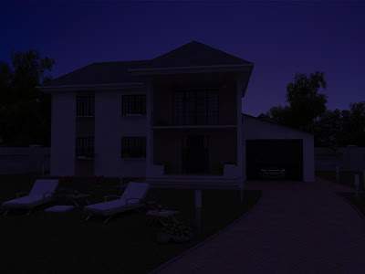
Tutorial 3Ds Max Cara Merender Suasana Malam Hari Dengan Vray

tutorial-3dsmax-vray

OK langsung aja, untuk postingan kali ini, tak informasikan kepada anda semua bagaimana cara merender eksterior rumah pada saat suasana malam hari dengan vray, hasilnya seperti gambar diatas. Perlu diketahui juga bahwa tutorial ini di-peruntuk-kan bagi anda-anda kabeh yang sudah menguasai program 3Ds Max, karena penjelasan dalam tutorial ini di persingkat ben ora capek ngetiknya dan banyak makan tempat, jadi jangan salahkan daku jikalau dirimu radonk, he3x, selamat mengikuti tutorial berikut ini...


In this tutorial I will go through all the steps that we usually do when I’m asked to do an “exterior night-rendering”. In order to follow it you need to know the basics of 3ds max and vray
1) Natural light The first step is to choose a background image of a sky. For this tutorial I have used the image bellow

tutorial-3dsmax-vray
Now put the desired image into the environment slot (3d max’s environment slot, not in vray’s). In the vray settings, check global illumination, select lightcache for secondary bounces, irradiance map for primary (you could also use brute force, but it will take longer to render). In the global switches tab, make sure that “default lights” is unchecked.

Last but not least go to the vray environment slot and check “GI environment (skylight) override. In the slot right beside put a gradient (dark blue in the upper slot, a lighter blue in the middle and a pale orange or purple in the lower position)
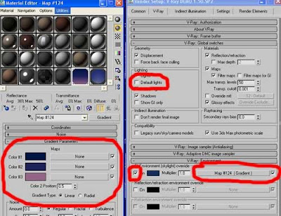
tutorial-3dsmax-vray


tutorial-3dsmax-vray
2) Adding artificial lights inside As you notice, it is starting too look like a night rendering, but at the moment it lacks artificial lighting so the spaces look deserted.

We will begin by adding vray lights inside the house, to simulate artificial lighting. The important thing to keep in mind at this point is that artificial light can look different from one case to another depending on many factors (intensity, color temperature, size of the space that is actually lit, etc.) so you shouldn’t put a light source and instance it all over the place. Be creative and play with parameters like intensity multipliers, filter colors, etc. For this scene I have used spherical vray lights with intensity multipliers varying from 1 to 2, filter colors with orange, yellow and blue tints and different a radius for each one
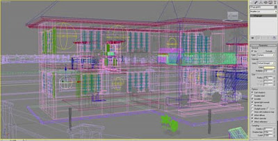
tutorial-3dsmax-vray

If you hit another render you will end up with something very similar to the following.
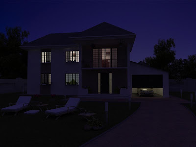
tutorial-3dsmax-vray
3) Simulating artificial light “spreading” from inside Now we have light inside the house, but the light doesn’t seem to “come out” enough. Therefore we will place vray planar lights just in front of the windows, pointing towards the exterior, like in the following image
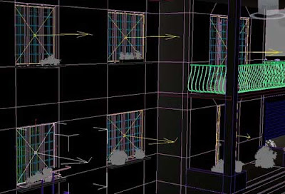
tutorial-3dsmax-vray

Hit another test rendering and you should have something similar to the render bellow:
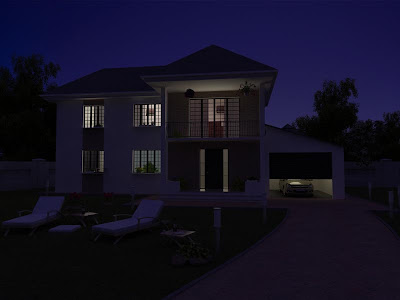
tutorial-3dsmax-vray
4) Adding artificial lights in the courtyard We are getting closer. What doesn’t look right at the moment is the fact that the courtyard is too dark. Depending on your scene, you may have exterior lighting fixtures (like the lighting posts that I have in this scene), or even exterior spotlights that illuminate the building. If you don’t have specific instructions for these, you could place lights somewhere behind the camera, so that you give the impression that the space is receiving illumination from neighboring sources (street lights, car lights, or even other buildings).

In this particular scene, adding lights to the lighting small garden lighting posts should be enough. First I have assigned them a vraylight material with a gradient map; than I have placed vray spherical lights over each one. For each vray light in the courtyard I have excluded the lighting post bellow it. This is kind of a fake, but in the end it looks right, and that’s all that matters. (If you want to do it more “accurate” check out the lampshade tutorial as well).
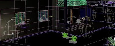
tutorial-3dsmax-vray

Hitting a test render at this stage you should obtain something like this:
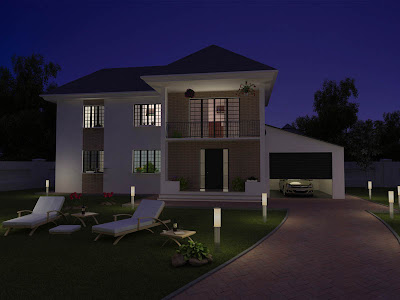


tutorial-3dsmax-vray

5) Photoshop touches a) Add a subtle glow effect to the visible artificial light sources (in this case, the small lighting posts). You can do this using the diffuse glow filter. b) In a new layer, add a linear gradient from bottom to somewhere at the middle from orange to transparent. Put the layer on “color” and play with the transparency until you like the result. If you are feeling creative, you can also try some subtle brush strokes, with different tints of red, yellow or orange to create diversity. After having done all of the above, here is the final image

(CLICK THE IMAGE TO VIEW A HIGH RESOLUTION RENDERING)
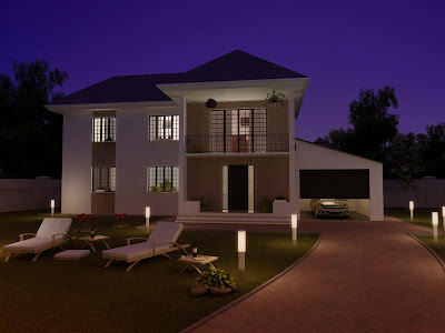


tutorial-3dsmax-vray

Conclusion Rendering an exterior at night can be very tricky. The best approach in my opinion is to take it systematically by starting with natural light, and adding artificial lights one by one during the process. Otherwise, you may find yourself lost not knowing where you did something wrong. I can not stress enough how important is to have a few examples of professional architectural photography at hand and look at them at every stage of the process. Here are some general guidelines that I always keep in mind when I’m doing a night rendering:
1) Even at night time the skylight still casts a subtle shadow. 2) Never make the sky 100% black; it should have either a blue or a purple tint. 3) If there are no artificial lights on the ground, the sky will always be brighter and the ground would “borrow” a bluish or purple tint from the sky 4) The lighting is a mixture of dark purple/bluish tints at the upper part and orange/yellow on the ground and on the building(s). That is because the natural light blends with artificial light sources placed on the ground. 5) The colors are more saturated in a night rendering that in a daytime one. 6) Artificial light sources have a subtle glow around them. 7) If you have “moving objects” in your scene, don’t be afraid to use motion blur. If you know a bit about photography, you are aware that at night time photographers use high exposure times when they target architectural subjects; this causes all moving things around (cars, people, etc) to appear with motion blur. If you think that I have missed something, feel free to post a comment and let me know.
Source : www.cgdigest.com